
We have updated our Trending tool with a new easy to use interface. This article aims to provide you with a brief overview of the new menu used to build and edit Graphs.
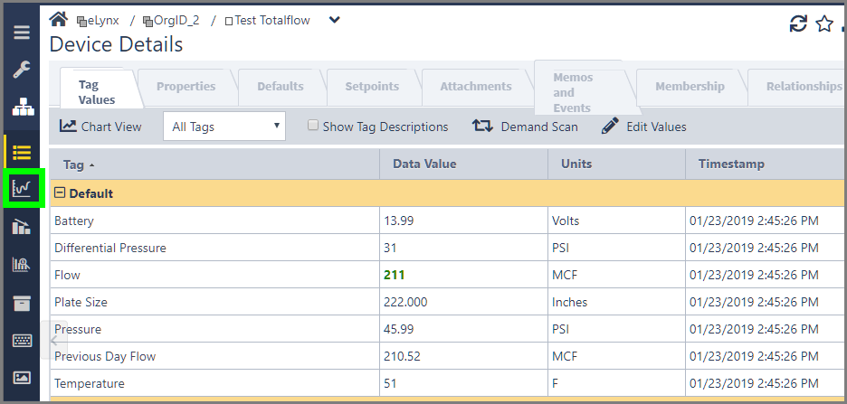
You will now see a full-screen menu that walks you through setting up your Graph, while giving you greater context about the options available. This menu uses the same style we added to the Summary Listing earlier this year. To get started using the new Trending menu, navigate to a Device and chose the Graph icon on the toolbar:
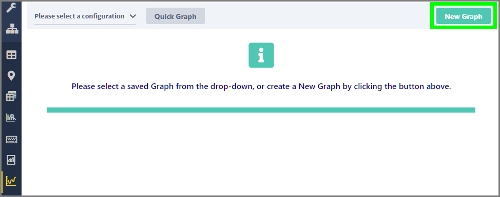
Per the instructions on the page, you can choose a saved Graph from the drop-down at the top left, or create a new Graph. For this example, let’s build a new Graph. Clicking the “New Graph” button at the top right will bring us to the Format Graph page:
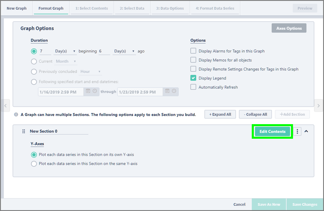
Each Graph is built using at least one Section. Each Section is initially created with defaults for the Name, Duration, and Y-Axes settings. You are free to change these at any time, though we advise you to set these options from the beginning if possible. Once you are ready to begin editing, click the “Edit Contents” button to move into building the Section:
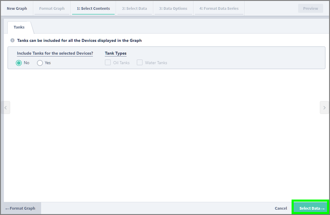
You will be taken to the Select Contents page, where you can choose to include data for Tanks in the Section. This choice defaults to “No”, but you can elect to include Oil, Water, or both types of Tanks. Once you’ve made your selections, click the “Select Data” button at the bottom right to move on to the next step:
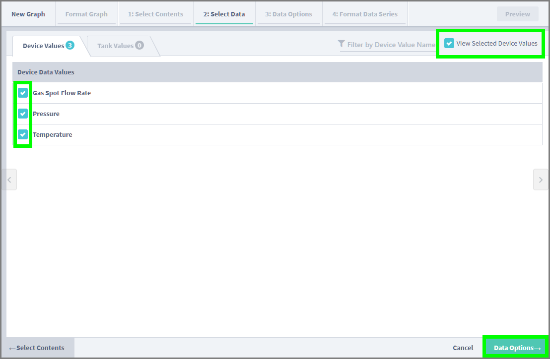
On Select Data, you will choose the Data Values you want to see in the Graph. You can use the Filter, or “View Selected Data Values” to narrow the list of available Values. Once you’ve selected at least one Value, the “Data Options” button will be enabled at the bottom right, prompting you to the next step:
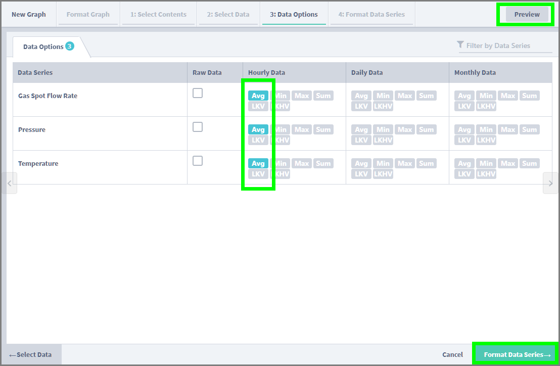
On the Data Options page, you will choose how you would like to see the data for each Value. Once you’ve selected the options you want to use for each Value, the “Preview” button at the top right will become active, allowing you to see what the final result will look like with the current options. The “Format Data Series” button will also be enabled at the bottom right:
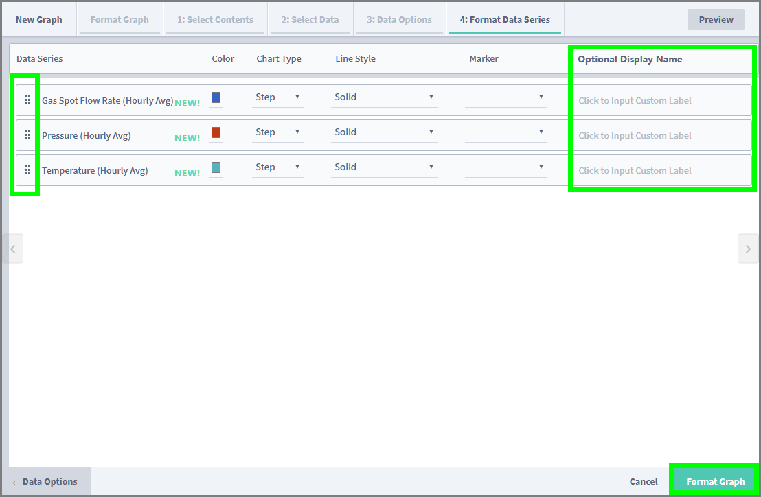
On the Format Data Series Page, you can use the drag-and-drop handles on the left side of each Data Series to rearrange their order. You have the option of defining Color, Chart Type, Line Style, and Marker for each Value, and you can also add an Optional Display Name. All of these options will have defaults, so you don't need to make any adjustments. Clicking the “Format Graph” button at the bottom right will complete the configuration for the Section:
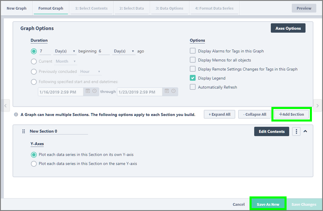
Back at the Format Graph page, we can now add additional Sections, jump back into editing the Section we just built, edit the Axes options, or choose to save our Graph. Notice the “Save As New” button at the bottom right is now enabled.
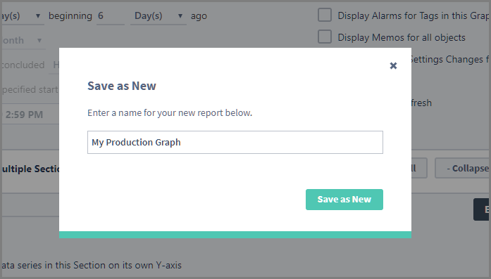
Choosing the Save option will prompt you to give the Graph a name:
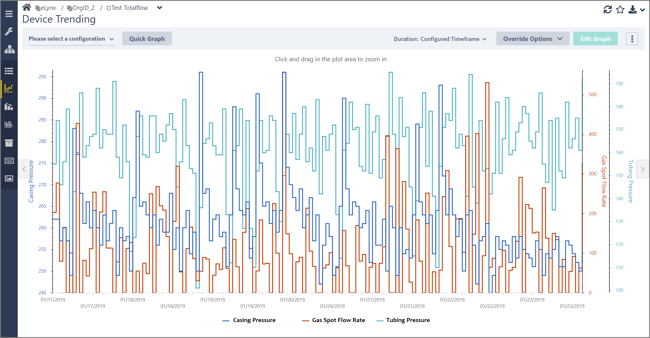
Once you give the Graph a name, the system will close the menu and automatically plot the Graph:
Our goal with this update is to make Trending more accessible for everyone. We invite you to build new Graphs and let us know what you think of the experience. Feedback from our users helps us build better tools that help everyone get more value out of the application. Please visit this page and send us a message. Our Support team will get back to you promptly.
Comments
0 comments
Please sign in to leave a comment.